top of page

Ortus
Recruitment
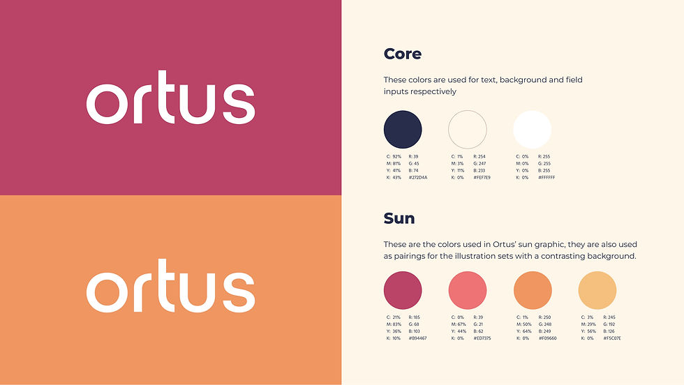
I led the full rebrand for Ortus, a female-led recruitment agency, with the goal of creating a distinctive identity that would set it apart from the typical corporate designs commonly seen in the recruitment sector. The inspiration for the brand came from the word "Ortus," which means sunrise or rising. This concept of new beginnings and growth became the foundation for the entire
brand identity.

I directed the art and designed all the brand collateral, including business cards, while incorporating a minimal yet impactful interpretation of a sunrise. The sunrise imagery was used to symbolize a fresh, forward-thinking approach to recruitment, highlighting Ortus’ unique perspective
and values.
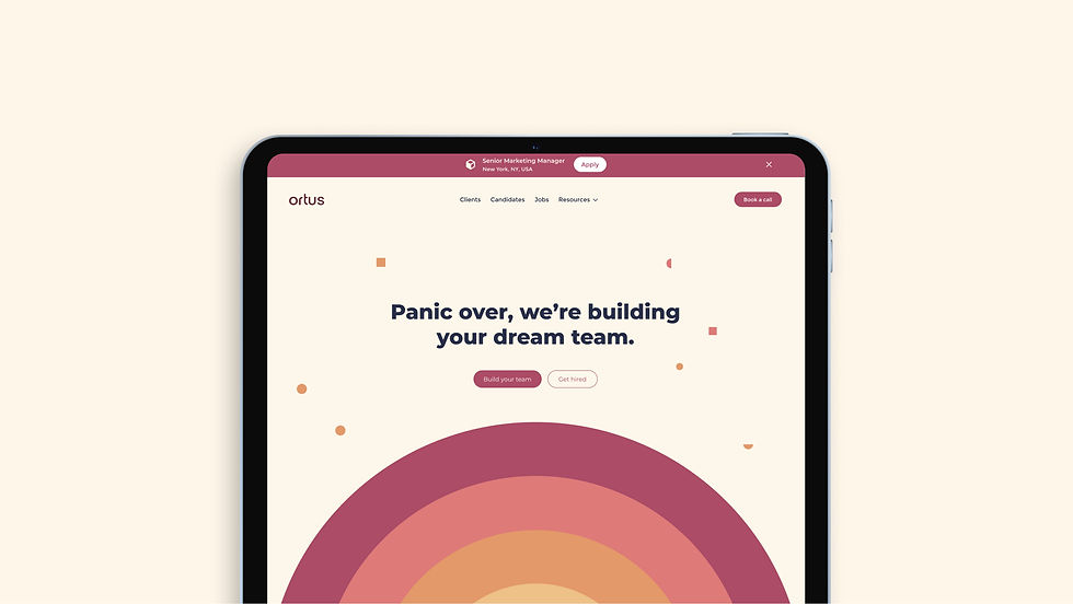
The result is a modern, clean identity that breaks away from the traditional, often generic aesthetic of the industry. The rebrand reflects Ortus' commitment to innovation, empowerment, and a progressive approach to connecting businesses with talented individuals.


More Projects


bottom of page