top of page

Pepper HQ
Hospitality Platform
Pepper HQ's Quickpad is a cutting-edge solution designed to streamline restaurant ordering processes by enabling staff to take orders and payments directly at the table, enhancing efficiency and customer satisfaction.
pepperhq.com
For the Quickpad branding, I led the initial design efforts, aiming to create a logo that embodies speed and efficiency.

The design features a dynamic gradient circle for the letter "Q," conveying motion and quick service. This theme of speed is consistently reflected throughout the branding elements.
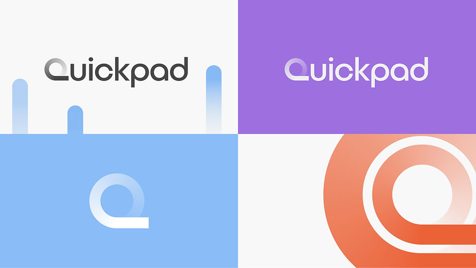
The color palette was carefully selected to maintain a connection to Pepper's original branding while introducing subtle variations. This approach ensured that Quickpad's identity was distinct yet harmonious with Pepper's established visual language.


I also collaborated with Pepper HQ to develop a distinctive illustration style for their brand, tailored for use across their website. The illustrations were designed to be both engaging and functional, depicting key aspects of the business, such as card transitions and ordering.

To complement the illustrations, I also created custom, responsive icons that helped reinforce the cohesive identity of the site, ensuring a seamless and visually appealing user experience across different devices.


For the illustrations, I drew on the company’s colour palette to create visuals that were inviting and friendly while maintaining a grounded, realistic approach. I chose to represent actual people in the illustrations to reflect the brand’s human-centred approach to business.
More Projects


bottom of page